Aug16
Snore Partner: two modes for two user types
For those who snore and for those who hear it

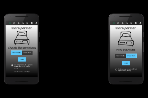
Snore Partner has been developed with two user types in mind. One, the partner, looking for facts. The other, the snorer, looking for ways to minimize them.
With these two user types in mind we have designed a multi-UI App. Partners need a few parameters and they will only concentrate on them. Giving them more information will probably make the App less interesting.
On the other side, Snorers need as much information as possible. Snoring sound has been analysed to extract as much information as possible and some "metrics" that are only particular to this App have been created.
On the other side, Snorers need as much information as possible. Snoring sound has been analysed to extract as much information as possible and some "metrics" that are only particular to this App have been created.
Another particular detail to this App is the User Interface. Handling 24 parameters, making them available upon subscription and leting the user disable them as well, is a UI/UX challenge.
Again we have used colors and two menu levels. The first one let the user forcus on one parameter. The second one let the user choose a graph representing that one in certain conditions (See screenshoots on the right of this article)
We have solved this using drawables, shaping the parameters with doted lines when disabled or not subscribed and in this last case, using the "standard" grey color.
Users know also any time if the information they are seeing is subscribed or it is disabled. Green background color for subscribed, greey background again for disabled or not subscribed.
The App is also fully functional any time for all users, except that it shows "Demo Sample Values and Graphs" to users not subscribed to that parameter.
Subscriptions run for as short as a week and can go to months or years. Advertisment can also be disabled by making a purchase.
All in all we are very happy with the experiment. Now we are working hard to make this App available to as much users as possible mostly using Search Engine Optimisation techniques.
No video selected.


